 Is responsive design overrated? Of course, no marketing method or design type is perfect, and responsive design is no exception.
One of the most appealing aspects of responsive web design is that a responsive website can provide a great user-experience across many devices and screen sizes. This is an important characteristic, since it is impossible to anticipate all the devices and screen sizes searchers will use to access your site. A site that works well regardless of these variables will provide a better and more consistent user-experience than a separate mobile site that is designed for a specific device and screen size.
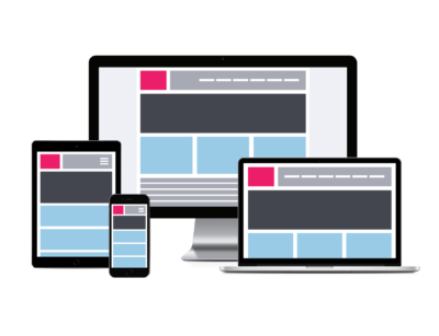
Ever notice how some websites change sizes or orientations based on whether you’re viewing from a large desktop or a small smartphone?
This functionality has a name — it’s called responsive web design, sometimes referred to as “RWD.”
Creative Web Design 123 makes all of the websites we develop use responsive design. As a result, we sometimes get questions from clients about this highly adaptive technology.
Responsive websites not only look attractive — they offer several critical benefits over non-responsive sites. If your site isn’t already equipped with responsive technology, here are four reasons why now is the time to make the switch:
1. It provides an unparalleled user experience across different devices and resolutions.
The number of mobile users is higher than ever, and as that number continues to grow, businesses must be ready to meet those unique needs. Luckily, responsive sites are compatible with both desktop and mobile users, so none of your potential customers are left out.
2. It speeds up your website’s loading time.
Ever navigated to a site and clicked away because it took too long to load? You’re not the only one. There are several tactics for increasing load times, and implementing a responsive site design is one of them. Responsive sites are much faster than non-responsive sites, which means your visitors are less likely to give up on you.
3. It’s great for search engine optimization (SEO).
Google rewards responsive sites with better search engine rankings. If you’re concerned about the SEO strength of your site, having a responsive website is crucial. In 2012, Google’s Pierre Farr stated that the search engine favored responsive websites over sites that merely had mobile templates. Why? Because it’s easier for Google to crawl one URL as opposed to the multiple code base approach that requires separate URLs for desktop and mobile versions.
4. It simplifies the development process.
Responsive design isn’t just great for site visitors — it also streamlines the web development process because web developers aren’t required to create multiple sets of code for different devices and screen resolutions.
Additionally, in early 2015, Google announced that mobile-friendliness would become a ranking factor in its search engine algorithms. This meant that sites that were mobile-friendly would potentially lose some ground in search engine results because they wouldn’t be delivering a good experience to mobile searchers and viewers.
In summary, the benefits of choosing responsive design for your website include:
- Cost effectiveness
- Flexibility
- Improved user experience
- Search engine optimization gains
- Ease of management
Responsive web design is recommended by Google, it allows one website to provide a great user-experience across many devices and screen sizes, and it also makes managing your SEO strategy easier. For these reasons, responsive web design is the best option for your mobile SEO strategy.
The Potential ROI
Having seen the ever-growing demand for responsive design, it’s hard not to acknowledge the tremendous ROI you’ll be receiving on your investment in a new mobile-friendly site. From snagging customers that otherwise would’ve bounced from your site to keeping your existing customer base happy, there’s no denying the value of a clean, effective responsive design.
Let us help you in your web marketing today!

Leave A Comment
You must be logged in to post a comment.