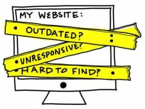
 Six Warning Signs Your Business Website Is Outdated. An updated website can make a huge difference for your business, Your website needs to keep improving. Finding signs that your website needs a redesign.
As the technology keeps expanding, so does a website’s need to keep improving. Trends are here to day, gone tomorrow, they are hot one day, and almost forgotten the next. Unfortunately some outdated web design trends are still around, and they really have to go! Some outdated web design trends and habits just don’t seem to go away peacefully, so we are calling them out!
How do you know when it’s time to update your website?
It’s not always an easy question to answer. You might love the design that was developed a few years ago or have a personal stake in the layout that makes it hard to be objective. As long as your website still generates some leads it’s good enough, right? You personally may not see any issues with your website… but what about your prospects and customers? The Internet moves quickly and you don’t want to be left behind because of personal bias or worse—because you haven’t been paying attention to how your site is performing.
1- Your site looks like it was designed years ago.
While web design is subjective there are styles that are decidedly not. A few years ago websites were designed to fit in one browser window configuration. Home pages were squeezed in ‘above the fold.’ And it was common to see designs boxed in with margins of colors—or literal boxes. Those designs feel very outdated in an Internet that is now focused on flow. Today’s websites make better use of the space in which they are viewed and are responsive to best fit the user’s viewing choice. Navigation flows in different ways and site pages are far from boxed in.
2- Your sales team is embarrassed to give out the URL
Perhaps the strongest sign your website needs a redesign? Your sales team stops telling prospects and customers about it. A good website is one that your sales team wants to pull up on a sales call and use as a tool to close the deal.
3- Your site is more than 5 years old.
While there’s no hard and fast rule for how long a website should last, there have been a lot of advances in technology, best practices, and how Google ranks sites in the last few years, so if your site is more than a handful of years old, it could probably benefit from some level of overhaul.
4- Your site is not delivering the traffic, leads and conversions you expect.
If your website is getting a little long in the tooth but still gets results for your business, there’s probably no reason to mess with a good thing. But if you’ve seen significant drop-offs in traffic and leads, your visitors are clearly not finding what they’re looking for, and you might want to consider a site upgrade to bring them back.
5- All your competitors have newer websites.
While it’s true that you should do what’s right for you rather than blindly following what others are doing, if your competitors have websites that look and work better than yours, you’re going to be at a significant disadvantage. If your website is lagging behind competitors, consider an update to propel you to the front of the pack.
6- Small changes are difficult or impossible to make.
Making small changes or updates to your site, like adding a blog post, updating an event, or changing a product description, should be easy for anyone on your staff to accomplish. If your website is built on a platform that is difficult to work with, or that requires a third party to make even the simplest updates, consider a new website built in an easy-to-use content management system (CMS).
These are only a few signs that you site is outdated, and needs to be updated.
If you are not certain which web design trends you should incorporate, and which you better avoid, don’t worry. Simply reach out to us instead. We would be happy to go through the various options and help you avoid outdated web design trends.


Leave A Comment
You must be logged in to post a comment.